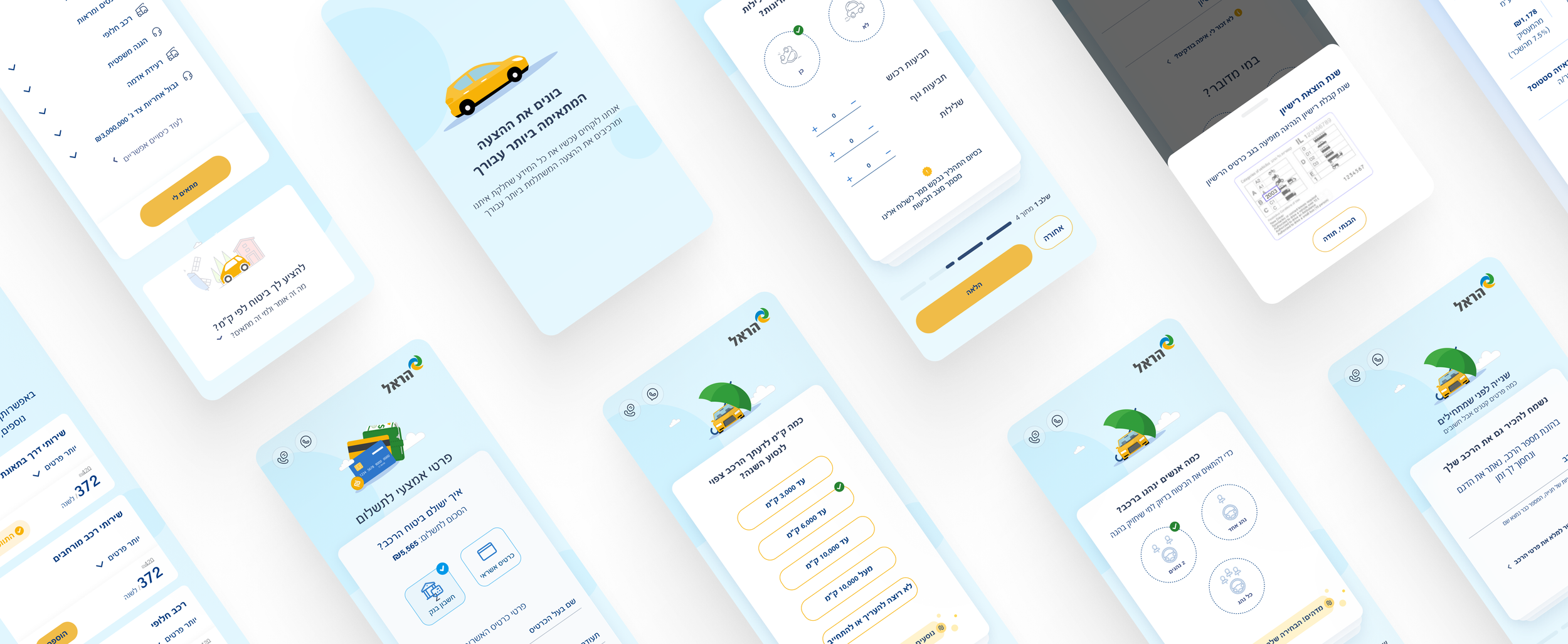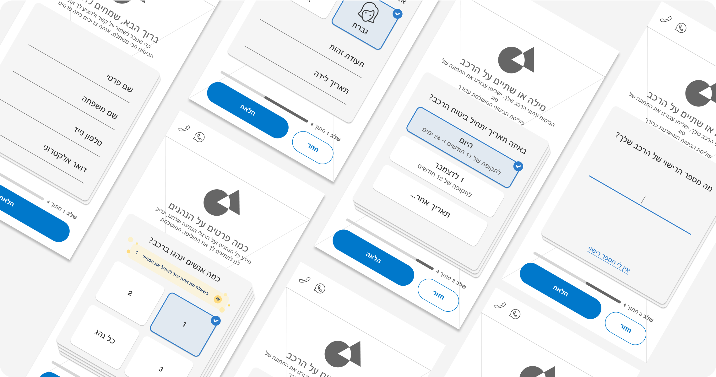
Harel’s Car Insurance App
The business identified an issue with low retention rates among users who started the registration process, which was negatively impacting key KPIs such as conversion rates and customer engagement. To address this, we focused on understanding the root causes of the abandonment and explored solutions to improve user retention, ultimately creating an innovative and enhanced experience to boost these critical KPIs.
My role: UX design, UI design
Why do they need redesign?
📉 Low Conversion Rate – The analytics team reported that the conversion rate is significantly low, indicating that many users abandon the process before reaching the purchase.
🚗 Strong competition in the Car Insurance Market - The car insurance market is highly competitive, and data shows that Harel is not among the top-selling insurance providers. This required us to rethink the process, making it more strategic and marketing-driven.
⚡️ Design Update – The app’s design no longer aligned with current standards and modern design trends, nor did it match the visual language used by competitors. It was essential to update the design to meet current standards, enhancing both usability and the app’s competitiveness.
The Old Design
Lacking User Interviews, We Turned to Quantitative Research
Since there was no time to conduct interviews with users, we considered it appropriate to base ourselves on existing data. In order to answer the first research goal - ‘Increasing the percentage of process finishers’, we had to first understand what was the reason that led others abandonment. So we ran analytics and found the following data:
88%
High Drop-off Without Interaction
Most users abandon the process without taking any action, indicating that they might not be fully engaged or motivated to proceed.
22%
Enter incorrect information
Some users input incorrect information, which may indicate that they are not serious about purchasing at this stage.
Assumption
Most users enter the app with the intention of comparing prices rather than purchasing insurance
Therefore, the key question we need to address is:
How might we convince the user to complete the process when their primary goal is just to compare prices?
UX principles that will help us build a solution
First Impressions Matter
A well-designed landing experience with a clear value proposition can capture users’ attention, build trust, and encourage engagement rather than immediate drop-off.
Building Trust Before Commitment
Instead of dismissing users who enter incorrect information, we will not ask for personal information before we have provided real value.
Supporting User Intent
The interface should provide a solution to their comparison mindset and encourage them to return later.
Competitive Analysis Findings
🧠 Not relying on memory
Helping the user to fill in details that are not necessarily remembered
💪🏼 Positive feedback
Feedback was presented in places where they managed to lower the price
😌 Trust feeling
Explaining why we require certain details and how providing them benefits the user.
⏱ Timing
Identify when the user is already invested in the process to request personal information
👣 Using wizard
Inform the user about the current stage through a wizard
👄 Tone of voice
Using a more conversational and less ‘Insurance- Like’ language
Bringing it all together

Design Principles
We laid down some principles based on UX research findings and data analysis, based on which we structured the entire redesign.
One action per screen
👆🏼
Reducing potential friction points
Gamification
🕹
To encourage the involvement of the users
As part of the comparison mindset
Quick and Easy
🏃🏽♀️
Actionable
📣
Push the user to complete the flow.
Main Screens
Focusing on creating an innovative, youthful experience, full of gamification, that breaks free from the traditional "insurance" product box.
Nice to meet you
01
Focus on Vehicle Details First
The first screen focuses on the vehicle details rather than the user's information. It's often easier to provide details about the car than about ourselves.
We allowed users to enter general vehicle details instead of the car number, assuming it's easier to remember basic information rather than car number. This approach helps reduce friction and increases the likelihood of progressing to the next step.
Easier Input with Vehicle Details
Not Relying on Memory Only
We used copy that guides users to quickly locate their car number, assuming that people don’t always remember it. This guidance reduces possible friction.
The design features cards to create a gamified experience, along with a hint of how many steps remain. Moving to the next step “flips” the card, adding an engaging visual cue.
Gamification
Positive reinforcements
02
Checking driving habits
We incorporated positive reinforcement for responses that lower the user’s costs, creating a more encouraging and rewarding experience.
Rewarding Microcopy
Recognition Over Recall
03
Clues that make identification easier
Instead of requiring users to remember the year they obtained their driver’s license, we provide a helpful prompt suggesting they check the back of their license card.
Helpful Prompts
Loading screen
04
Labor Illusion
We applied the Labor Illusion effect to the loading screen before displaying the price quote. By showing a brief processing animation, we created a sense of thoroughness and reliability, making users feel that the system is working hard to provide them with the best possible offer.
Price offer screen
05
The effort pays off
We identified a business opportunity to address a need users may not have considered, offering a solution that could be highly relevant to them.
Spotting Opportunities
We added a persistent price summary at the bottom of the screen, updating in real time to show how adding coverage affects the total cost.
Sticky Price Summary
Key Takeaways from the Process
It was a lot of fun working on this project! - The biggest challenge was transforming an insurance product-often seen as a dull, complex field-into something light, user-friendly, and far removed from the typical insurance experience.
Improving Products with Creativity and Resources - By utilizing available data and analyzing user behavior, we can make informed decisions that lead to impactful improvements within time and budget constraints.
You may also be interested in these
WalkMe System’s Settings B2B System
Harel’s Financial Check Up Web/Mobile


